January 26, 2014

Extreme Makeover: Cabinet Edition

Another debate we had early on was trying to decide the best way to update our kitchen cabinets. The cabinets were a nice, solid wood so we really didn't feel like it was necessary to completely tear them out and start over (nor did that fit in the budget!), but they were really worn in spots from years of use and just had an overall dated look, so they definitely needed some attention.


After toying with some other ideas, we eventually decided that a coat of paint would be the most predictable way to cover all the wear spots while also giving the cabinets a fresh, updated look. I was also really loving the white/off-white kitchens I had been seeing online so it was a win-win! 

I chose Sherwin Williams Antique White:


I actually stole this color idea from my parents who just re-did their kitchen last year and used this color for their cabinets. It was just a basic off-white and I loved how it turned out in their kitchen, so I went with it. Which is probably a good thing because I think if I would have had to sort through a million different shades of white I might have gone insane.

So since we had plenty of time and plenty of room (we aren't trying to live in the house while all of this is going on) we knew this would be a DIY project we could handle. I actually took this on as my personal project over Thanksgiving/Christmas break while Adam and my dad were working on the rest of the painting. So after a crash course in cabinet painting from my dad who had just re-painted his cabinets last year, I got to work!

I took everything off the cabinet frames (doors, shelves, and drawers) to make it easier to paint. The first thing I did was give everything a thorough cleaning using some paint prep material and then lightly sanded everything down to remove the top varnish and hopefully create a paint-friendly surface.


Here's a look at the set up: A set of sawhorses with two rows of 2x4's across the top and bottom. I then used these cabinet knobs (old hardware from my parents' kitchen) to rest the doors on while painting so that I could get to the edges. 

ALLLL the doors, drawers, and shelves finally finished!

Once I finally finished all the unattached stuff, I started on the frames... 
and found a 1950s surprise behind the cabinets... Check out that sweet wallpaper!!
WHAT a difference we saw after getting those frames painted! 
I give my mom major credit for the idea to paint the top part of the cabinets Latte (which is the same color as the Dining Room/Den). The Latte and the Antique White coordinate so well and it really looks good to break up the cabinet color while also bringing in the Latte from the other part of the room. 

Remember this lovely wooden valence above the window?
I think this one piece completely dates the kitchen aside from anything else and I have been wanting to knock this thing down since the day we moved in! 
Here is Dad doing the honors of sawing it in half.
And there it is! No more valence and looking SO much better!!


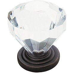
So finally after weeks of prepping, cleaning, and painting, we were ready to attach new hardware and rehang the cabinets! One of my favorite features of the house are the original crystal doorknobs, so when I came across these knobs online I knew it would be the perfect way to keep a unique charm in the kitchen while also giving it an updated look! 
I decided to pair these with a basic pull for the drawers.
My crew hanging the beautiful cabinets! 
(Which was, let me tell you, NOT as easy as it seems)

And here is the painted finish!!

So there you have it.. my cabinet makeover!! And although there is still a lot left to be done in this little ol' kitchen.. what a difference a coat of paint makes!! 

January 15, 2014

Not for the Indecisive

Whew! It didn't take long for me to figure out that deciding paint colors is NOT an easy task! At least not for me. I found it so challenging to try to have some sort of idea where I wanted to go with the entire room (fabric, curtains, furniture, etc) so that I could decide on the right paint color to coordinate. I probably allowed this to be way more overwhelming than it should be, but when you have painters ready for their next room color decision and a book with about 2000 different colors to choose from it can really feel that way!! Needless to say I spent A LOT of time studying the huge SW color wheel, spent way too much money on paint samples (those things can really add up!), and could rattle off more SW paint color names than any one person should know. But, we eventually got every room decided and I am so happy with the way they all turned out!

I also want to give a HUGE THANK YOU to my Dad, "Handy Randy" as we nicknamed him, for all of his help on this house. Without him, we would not have accomplished even close to what we have so far. He has spent pretty much every spare moment of his time working on this house like it was his own, and we could not have tackled any of these projects without him. We certainly owe him big time! And also a HUGE THANK YOU to my Mom who we have dubbed my "design consultant". She has agonized with me over paint colors, fabric choices, and bedding when I'm sure she had much more important things to worry about, and has been able to lend much great decorating advice when I am in desperate need of a second opinion.

So, here is what we ended up with--

The first part of the painting we actually tackled after the ceilings was all the trim. This included crown, baseboards, window frames, door frames, doors, built in bookcases, and the mantle. For this we used Sherwin Williams Extra White which is actually what comes in the paint cans before adding any tint. This is what is recommended to use when you are looking for just a standard bright white. Although it is hard to appreciate in pictures.. painting this trim work provided a DRASTIC improvement in the looks of this house. I mean.. WOW. This trim was in serious need of a paint job and the way it popped with a fresh coat of that Extra White looked SO good!  


In these pictures you can see that the window and baseboards have been painted but the bookshelf hasn't. This shows how drastically different the bright white looked against the old, dirty white. 


Now, on to the good stuff...

Living Room
The living room started out a grey-ish color. Not bad, but didn't really work for what I knew I wanted to do with this room. We painted it Sherwin Williams Copen Blue


Dining Room/Den
This is the largest room in the house and connects to the kitchen. It was originally a very drab beige that just wasn't doing much for the room. I knew I wanted to do a dark beige color to make this room really pop, especially with all the white trim surrounding it. This was the color I definitely had the hardest time figuring out. It took quite a bit of samples to finally nail it down...


 ..but the painful search definitely paid off when we finally landed on Sherwin Williams Latte! The guy at SW told us this was the most popular beige family color card (a very neutral beige without too much pink, grey, or gold tones) and we ended up using other colors from this card in other rooms in the house which gave the feel of continuity I was looking for. I don't have many pictures of this room but I really love how the Latte turned out. I think it gives just the right amount of statement to this big room and it coordinates really well with the Copen Blue in the Living Room (in the Living Room photo above you can see the Latte through the doorway against the Copen Blue).


Master Bedroom
Originally another drab beige, we painted it Sherwin Williams Rainwashed:


It actually looks a lot bluer (less gray/green) in real life than what this swatch shows. It's very similar to the Copen Blue from the Living Room.. just a little bit lighter. Gives the room such a fresh, bright feel!


Master Bathroom
Goodbye pink!!! The pink they decorated these bathrooms with has been bugging me from day one. We painted both bathrooms Sherwin Williams Kilim Beige:


This is from the same card as Latte, two shades lighter. The perfect neutral to compliment the tile work in the bathrooms.


Hallway
This was another space I couldn't wait to spruce up. The walls were literally plain white. We painted it Sherwin Williams Latte to match with the Dining Room/Den area to keep some continuity. It looks MUCH better than the plain white, and I no longer cringe when I see the hallway. 


Guest Bedroom #1
We decided to keep this room pretty neutral, but I also wanted to change it up from the beiges we had been using elsewhere. We went with Sherwin Williams Pavilion Beige which is another good neutral beige and I think it will go well with our current bedding.


Guest Bedroom #2
Although I didn't mind the green that was here originally, it was not working against the blue in the Master Bedroom (this is the bedroom that connects to the Master). This room will be somewhat of an "office" for now, so I also wanted to give it a more sophisticated feel than it had with the green. I went with Sherwin Williams Nomadic Desert:


This is also from the same card as Latte, just one shade lighter. 


So there you have it! It really is amazing what a good coat of paint can do.. and this house looked better and better with every coat of paint we added! Hope you like it!